Last update 👈
David Palecek, August 8, 2025
Complex networks provide metrics and to identify kestone species bridges/bottleneck species within the community. EMO-BON data are unified in methods but highly diverse in respect to the metadata (sampling station, temperature, season etc.), which can be interpreted as control/treatment. To refrase a particular question in respect to seasonality, is there structural difference in taxonomy buildup in the communities between spring, summer, autumn and winter.
We will construct association matrices between taxa over the series of sampling events grouped by the factor (season in this case).
Recipe
- Load data
- Remove high taxa (non-identified sequences)
- Pivot table from sampling events to taxa.
- Remove low abundance taxa
- Rarefy, or normalize
- Remove replicates
- Split to groups on chosen
factor - Calculate associations (Bray-curits dissimilarity, Spearman’s correlation, etc.)
- False discovery rate correction
- Build and analyse network per group
1. Loading data and metadata
import os
from typing import Dict
import numpy as np
import pandas as pd

from scipy.stats import spearmanr
import networkx as nx

from momics.taxonomy import (
    remove_high_taxa,
    pivot_taxonomic_data,
    normalize_abundance,
    prevalence_cutoff,
    rarefy_table,
    split_metadata,
    split_taxonomic_data,
    split_taxonomic_data_pivoted,
    compute_bray_curtis,
    fill_taxonomy_placeholders,
    fdr_pvals,
)
from momics.utils import load_and_clean
from momics.networks import (
    interaction_to_graph,
    interaction_to_graph_with_pvals,
    pairwise_jaccard_lower_triangle,
    build_interaction_graphs,
)
from momics.plotting import plot_network
from momics.stats import (
    spearman_from_taxonomy,
    plot_fdr,
    plot_association_histogram,
)

from mgo.udal import UDAL

# All low level functions are imported from the momics package
from momics.loader import load_parquets_udal
from momics.metadata import get_metadata_udal, enhance_metadata

import seaborn as sns
import matplotlib.pyplot as pltAll the methods which are not part of marine-omics package are defined below. Documnetation and context for the marine-omics (momics) methods can be found on readthedocs.io.
def get_valid_samples():
    url = "https://raw.githubusercontent.com/emo-bon/momics-demos/refs/heads/main/data/shipment_b1b2_181.csv"
    df_valid = pd.read_csv(
        url, header=0, index_col=0,
    )
    return df_valid
valid_samples = get_valid_samples()
# load, filter and enhance metadata
full_metadata, mgf_parquet_dfs = load_and_clean(valid_samples=valid_samples)
ssu = mgf_parquet_dfs['ssu']
ssu.head()assert full_metadata.shape[0] == 181
print(full_metadata.shape)(181, 98)
Batch 1+2 contain 181 valid samples, which should be the first value printed above. Now we convert object columns to categorical variables
# Identify object columns
categorical_columns = sorted(full_metadata.select_dtypes(include=['object', "boolean"]).columns)

# Convert them all at once to category
full_metadata = full_metadata.astype({col: 'category' for col in categorical_columns})

if not isinstance(full_metadata['season'].dtype, pd.CategoricalDtype):
        raise ValueError(f"Column 'season' is not categorical (object dtype).")
2. Remove high taxa
First infer missing higher taxa if some lower taxon was identified using unclassified_ placeholder. Example of filled row of taxonomy can look like this:
kingdom phylum class order family genus species Archaea unclassified_Thaumarchaeota Thaumarchaeota unclassified_Cenarchaeales Cenarchaeales Cenarchaeaceae None None
taxonomy_cols = ['superkingdom', 'kingdom', 'phylum', 'class', 'order', 'family', 'genus', 'species']
ssu_filled = fill_taxonomy_placeholders(ssu, taxonomy_cols)
ssu_filled.head(10)Because many sequences are not well classified, information that the sequence is from superKingdom Bacteria is not helpful and does not add information value to our analysis. Here we remove all taxa which are only identified on phylum level and higher.
print("Original DataFrame shape:", ssu.shape)
ssu_filled = remove_high_taxa(ssu_filled, taxonomy_ranks=taxonomy_cols, tax_level='phylum')
print("Filtered DataFrame shape:", ssu.shape)
Original DataFrame shape: (111320, 9)
0%| | 0/218 [00:00<?, ?it/s] 0%| | 1/218 [00:00<02:44, 1.32it/s] 1%| | 2/218 [00:02<04:06, 1.14s/it] 1%|▏ | 3/218 [00:02<03:15, 1.10it/s] 2%|▏ | 4/218 [00:03<03:37, 1.01s/it] 3%|▎ | 6/218 [00:05<03:06, 1.13it/s] 3%|▎ | 7/218 [00:07<03:49, 1.09s/it] 4%|▎ | 8/218 [00:07<03:29, 1.00it/s] 4%|▍ | 9/218 [00:09<04:12, 1.21s/it] 5%|▍ | 10/218 [00:10<03:48, 1.10s/it] 5%|▌ | 11/218 [00:11<03:30, 1.02s/it] 6%|▌ | 12/218 [00:12<03:30, 1.02s/it] 6%|▌ | 13/218 [00:12<03:03, 1.12it/s] 6%|▋ | 14/218 [00:13<02:33, 1.33it/s] 7%|▋ | 15/218 [00:14<02:28, 1.37it/s] 7%|▋ | 16/218 [00:14<02:39, 1.26it/s] 8%|▊ | 17/218 [00:16<02:56, 1.14it/s] 8%|▊ | 18/218 [00:17<03:39, 1.10s/it] 9%|▊ | 19/218 [00:18<03:10, 1.05it/s] 9%|▉ | 20/218 [00:20<04:54, 1.49s/it] 10%|▉ | 21/218 [00:23<06:03, 1.85s/it] 10%|█ | 22/218 [00:26<06:49, 2.09s/it] 11%|█ | 23/218 [00:27<05:30, 1.70s/it] 11%|█ | 24/218 [00:28<04:45, 1.47s/it] 11%|█▏ | 25/218 [00:29<04:28, 1.39s/it] 12%|█▏ | 26/218 [00:30<04:02, 1.26s/it] 12%|█▏ | 27/218 [00:31<03:50, 1.21s/it] 13%|█▎ | 28/218 [00:32<03:33, 1.13s/it] 13%|█▎ | 29/218 [00:33<03:31, 1.12s/it] 14%|█▍ | 30/218 [00:34<03:23, 1.08s/it] 14%|█▍ | 31/218 [00:35<03:12, 1.03s/it] 15%|█▍ | 32/218 [00:36<02:59, 1.04it/s] 15%|█▌ | 33/218 [00:37<03:06, 1.01s/it] 16%|█▌ | 34/218 [00:38<03:10, 1.03s/it] 16%|█▌ | 35/218 [00:38<02:49, 1.08it/s] 17%|█▋ | 37/218 [00:39<02:01, 1.49it/s] 18%|█▊ | 40/218 [00:39<01:03, 2.80it/s] 19%|█▉ | 41/218 [00:39<00:57, 3.08it/s] 20%|██ | 44/218 [00:40<00:48, 3.62it/s] 21%|██ | 45/218 [00:41<00:56, 3.04it/s] 21%|██ | 46/218 [00:41<01:05, 2.64it/s] 22%|██▏ | 47/218 [00:42<01:05, 2.60it/s] 22%|██▏ | 48/218 [00:42<01:09, 2.46it/s] 22%|██▏ | 49/218 [00:42<01:00, 2.81it/s] 23%|██▎ | 50/218 [00:43<00:56, 2.95it/s] 23%|██▎ | 51/218 [00:43<01:00, 2.74it/s] 24%|██▍ | 52/218 [00:43<01:00, 2.76it/s] 24%|██▍ | 53/218 [00:44<00:58, 2.81it/s] 25%|██▌ | 55/218 [00:44<00:50, 3.22it/s] 26%|██▌ | 56/218 [00:45<00:55, 2.91it/s] 26%|██▌ | 57/218 [00:45<00:56, 2.83it/s] 27%|██▋ | 59/218 [00:46<00:46, 3.45it/s] 28%|██▊ | 60/218 [00:46<00:42, 3.68it/s] 28%|██▊ | 61/218 [00:46<00:36, 4.29it/s] 28%|██▊ | 62/218 [00:46<00:37, 4.21it/s] 29%|██▉ | 63/218 [00:46<00:31, 4.89it/s] 29%|██▉ | 64/218 [00:47<00:40, 3.79it/s] 30%|██▉ | 65/218 [00:47<00:37, 4.08it/s] 31%|███ | 67/218 [00:47<00:30, 4.95it/s] 31%|███ | 68/218 [00:47<00:26, 5.59it/s] 32%|███▏ | 69/218 [00:47<00:27, 5.46it/s] 32%|███▏ | 70/218 [00:48<00:26, 5.53it/s] 33%|███▎ | 72/218 [00:48<00:20, 7.08it/s] 33%|███▎ | 73/218 [00:48<00:26, 5.46it/s] 34%|███▍ | 74/218 [00:48<00:25, 5.75it/s] 34%|███▍ | 75/218 [00:49<00:31, 4.61it/s] 35%|███▌ | 77/218 [00:49<00:27, 5.18it/s] 36%|███▌ | 79/218 [00:49<00:23, 5.91it/s] 38%|███▊ | 82/218 [00:49<00:17, 7.78it/s] 39%|███▉ | 86/218 [00:50<00:10, 12.03it/s] 41%|████ | 89/218 [00:50<00:11, 11.41it/s] 42%|████▏ | 91/218 [00:50<00:17, 7.46it/s] 44%|████▎ | 95/218 [00:51<00:13, 9.43it/s] 46%|████▌ | 100/218 [00:51<00:08, 13.77it/s] 47%|████▋ | 102/218 [00:51<00:08, 14.11it/s] 48%|████▊ | 104/218 [00:51<00:07, 14.54it/s] 49%|████▊ | 106/218 [00:51<00:09, 11.79it/s] 50%|████▉ | 108/218 [00:52<00:10, 10.49it/s] 50%|█████ | 110/218 [00:52<00:11, 9.82it/s] 51%|█████▏ | 112/218 [00:52<00:14, 7.28it/s] 53%|█████▎ | 115/218 [00:53<00:11, 8.77it/s] 54%|█████▍ | 118/218 [00:53<00:09, 10.34it/s] 57%|█████▋ | 125/218 [00:53<00:05, 17.48it/s] 59%|█████▊ | 128/218 [00:54<00:09, 9.90it/s] 60%|█████▉ | 130/218 [00:54<00:09, 8.88it/s] 61%|██████ | 132/218 [00:54<00:08, 9.89it/s] 64%|██████▍ | 140/218 [00:54<00:04, 18.99it/s] 66%|██████▌ | 144/218 [00:54<00:03, 20.08it/s] 68%|██████▊ | 148/218 [00:54<00:03, 21.84it/s] 69%|██████▉ | 151/218 [00:55<00:04, 15.45it/s] 71%|███████ | 154/218 [00:55<00:04, 15.72it/s] 72%|███████▏ | 157/218 [00:55<00:04, 12.22it/s] 73%|███████▎ | 160/218 [00:56<00:04, 12.27it/s] 76%|███████▌ | 165/218 [00:56<00:03, 14.03it/s] 78%|███████▊ | 170/218 [00:56<00:02, 18.39it/s] 80%|████████ | 175/218 [00:56<00:01, 23.04it/s] 82%|████████▏ | 179/218 [00:56<00:01, 22.40it/s] 83%|████████▎ | 182/218 [00:57<00:01, 19.39it/s] 85%|████████▍ | 185/218 [00:57<00:01, 19.74it/s] 89%|████████▊ | 193/218 [00:57<00:00, 30.99it/s] 90%|█████████ | 197/218 [00:57<00:00, 29.44it/s] 92%|█████████▏| 201/218 [00:57<00:00, 28.66it/s] 96%|█████████▋| 210/218 [00:57<00:00, 41.78it/s]100%|██████████| 218/218 [00:57<00:00, 3.78it/s]
INFO | momics.taxonomy | Number of bad taxa at phylum: 9
INFO | momics.taxonomy | Unmapped taxa at phylum: ['Candidatus_Altiarchaeota', 'Hemichordata', 'Aquificae', 'Coprothermobacterota', 'Candidatus_Verstraetearchaeota', 'Orthonectida', 'Chrysiogenetes', 'Parabasalia', 'Candidatus_Rokubacteria']
Filtered DataFrame shape: (111320, 9)
3. Pivot tables
Pivoting converts taxonomy table which rows contain each taxon identified in every sample to table with rows of unique taxa with columns representing samples and values of abundances per sample.
ssu_pivot = pivot_taxonomic_data(ssu_filled)
ssu_pivot.head()Tidy data 💡
This is the step, when we violate tidy data principles, because the abundance is no longer single column (feature) and it is not even clear what the values in the table are now.
4. Remove low prevalence taxa
The cutoff selected here is 10 %, which means that all taxa which do not appear at least in 10 % of all the samples in the taxonomy table will be removed. This doees not refer to low abundance taxa within single samples.
ssu_filt = prevalence_cutoff(ssu_pivot, percent=10, skip_columns=0)
ssu_filt.head()5. Rarefy or normalize
Many normalization techniques are readily available to mornalize taxonomy data. For the purposes of co-occurrence networks, it is reccomended to rarefy [refs]. Please correct if wrong.
ssu_rarefied = rarefy_table(ssu_filt, depth=None, axis=1)
ssu_rarefied.head()6. Remove replicates
Anything which has replicate info count > 1 is replicate of some sort. Note that this information comes from the enhanced metadata information, because replicate info is not in the original metadata. It is a combination of observatory, sample type, date, and filter information.
It should be considered to filter replicates before steps 4. and 5. Identify replicates:
full_metadata['replicate info'].value_counts()replicate info
VB_water_column_2021-08-23_NA 4
VB_water_column_2021-06-21_NA 4
VB_water_column_2021-12-17_NA 4
VB_water_column_2021-10-18_NA 4
AAOT_water_column_2021-10-15_3-200 2
..
OSD74_water_column_2021-08-31_3-200 1
HCMR-1_water_column_2021-06-28_3-200 1
OOB_soft_sediment_2021-06-08_NA 1
ESC68N_water_column_2021-11-04_0.2-3 1
ESC68N_water_column_2021-11-04_3-200 1
Name: count, Length: 90, dtype: int64Remove the replicates:
filtered_metadata = full_metadata.drop_duplicates(subset='replicate info', keep='first')
filtered_metadata.shape
(90, 98)7. Split to groups on chosen factor
Split metadata to groups based on unique values in your factor.
FACTOR = 'season'
groups = split_metadata(
    filtered_metadata,
    FACTOR
)

# remove groups which have less than 2 members (bad for your statistics :)
for groups_key in list(groups.keys()):
    print(f"{groups_key}: {len(groups[groups_key])} samples")
    if len(groups[groups_key]) < 3:
        del groups[groups_key]
        print(f"Warning: {groups_key} has less than 3 samples, therefore removed.")
Spring: 2 samples
Warning: Spring has less than 3 samples, therefore removed.
Summer: 35 samples
Autumn: 44 samples
Winter: 9 samples
Split pivoted taxonomy data according to groups of ref_codes defined above:
# pivot and filter the ssu
split_taxonomy = split_taxonomic_data_pivoted(
    ssu_rarefied,
    groups
)

for key, value in split_taxonomy.items():
    print(f"{key}: {value.shape[0]} rows, {value.shape[1]} columns")
# split_taxonomy.keys(),

print(ssu_rarefied.shape)
split_taxonomy['Autumn'].iloc[:, 2:].head()8. Calculate associations (Bray-curtis and Spearman’s)
Bray-curtis dissimilarity:
bray_taxa = {}
for factor, df in split_taxonomy.items():
    bray_taxa[factor] = compute_bray_curtis(df, skip_cols=0, direction='taxa')
Spearman correlation:
spearman_taxa = spearman_from_taxonomy(split_taxonomy)

spearman_taxa['Summer']['correlation'].head()9. False discovery rate (FDR) correction
Calculate FDR
We have more than 1000 taxa in the tables, which means 1000*1000 / 2 association values. Too many to statistically trust that any low p-value is not just statistical coincidence. Therefore False Discovery Rate correction is absolutely essential here.
PVAL = 0.05  # Define a p-value threshold for FDR correction
for factor, d in spearman_taxa.items():
    pvals_fdr = fdr_pvals(d['p_vals'], pval_cutoff=PVAL)
    spearman_taxa[factor]['p_vals_fdr'] = pvals_fdr
Let’s crosscheck one particular set of DFs for one factor value, which should all have the same shape:
factor = 'Summer'
spearman_taxa[factor]['correlation'].shape, spearman_taxa[factor]['p_vals'].shape, spearman_taxa[factor]['p_vals_fdr'].shape
((260, 260), (260, 260), (260, 260))Display histograms FDR corrected p-values
For Bray-curtis dissimilarity we plot only the histogram. Does it make sense to do FDR? How?
plot_association_histogram(bray_taxa)values in the triangle: 33670
values in the triangle: 34716
values in the triangle: 22155
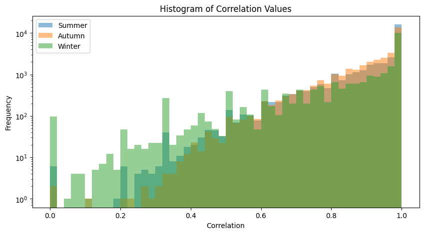
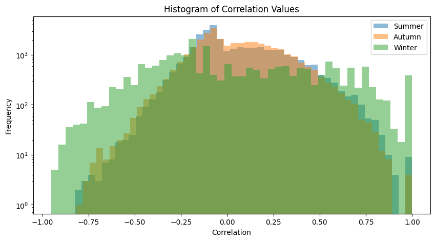
We performed FDR on Spearman’s correlations, so both correlation values and FDR curves are displayed.
plot_association_histogram(spearman_taxa)
plot_fdr(spearman_taxa, PVAL)
values in the triangle: 33670
values in the triangle: 34716
values in the triangle: 22155
### FACTOR: Summer ###
Significant associations before 11620 and after 1853
Associations significant before FDR but not after: 9767
### FACTOR: Autumn ###
Significant associations before 13870 and after 2655
Associations significant before FDR but not after: 11215
### FACTOR: Winter ###
Significant associations before 4535 and after 437
Associations significant before FDR but not after: 4098
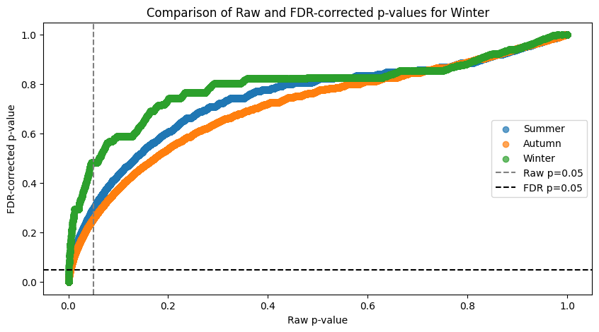
The FDR curve shows huge inflation of significant associations if taken from the raw data. The above print show the stats on how associations got discarded.
10. Build network for each factor value group
Nodes and edges for positive and negative associations (Example)
Code example for generating a list of nodes and significant positive/negative edges to construct the graph from.
for factor, dict_df in spearman_taxa.items():
    print(f"factor: {factor}")
    nodes, edges_pos, edges_neg = interaction_to_graph_with_pvals(
        dict_df['correlation'],
        dict_df['p_vals_fdr'],
        pos_cutoff=0.7,
        neg_cutoff=-0.5,
        p_val_cutoff=0.05
    )
    break
factor: Summer
Number of positive edges: 274
Number of negative edges: 87
Network generation and metrics calculation
At the same time as we generate the graph, we calculate several descriptive metrics of themetwork (implement saving of the network, if you need the graphs for later). We are going to look at:
degree centrality, which measures the number of direct connections a node (taxon) has. High degree centrality suggests a taxon is highly connected and may play a central role in the community. Therefore represents a so calledkeystone species.betweenness, which represents how often a node appears on the shortest paths between other nodes. Taxa with high/low betweenness may act as bridges or bottlenecks in the network, respectively.
network_results = build_interaction_graphs(spearman_taxa)Factor: Summer
Number of positive edges: 1661
Number of negative edges: 87
Factor: Autumn
Number of positive edges: 1304
Number of negative edges: 131
Factor: Winter
Number of positive edges: 429
Number of negative edges: 8
Jaccard similarity of edge sets
Jaccard similarity evaluates pairwise similarity of constructed networks.
For positive edges:
df_jaccard = pairwise_jaccard_lower_triangle(network_results, edge_type='edges_pos')
df_jaccardFor negative edges:
df_jaccard = pairwise_jaccard_lower_triangle(network_results, edge_type='edges_neg')
df_jaccardFor all edges altogether:
df_jaccard = pairwise_jaccard_lower_triangle(network_results, edge_type='all')
df_jaccardCompile dataframes from the dictionary. The dataframe structure is not ideal yet, feel free to open a PR here.
Here are two functions to generate quite silly dataframes of results:
def network_results_df(network_results, factor_name):
    out = pd.DataFrame(columns=[factor_name, 'centrality', 'top_betweenness', 'bottom_betweenness', 'total_nodes', 'total_edges'])
    for factor, dict_results in network_results.items():
        out = pd.concat([out, pd.DataFrame([{
            factor_name: factor,
            'centrality': dict_results['degree_centrality'],
            'top_betweenness': dict_results['top_betweenness'],
            'bottom_betweenness': dict_results['bottom_betweenness'],
            'total_nodes': dict_results['total_nodes'],
            'total_edges': dict_results['total_edges']
        }])], ignore_index=True)

    return out


def create_centrality_dataframe(network_results, factor_name):
    df_centrality = pd.DataFrame(columns=[factor_name, 'node', 'centrality'])

    for factor, dict_results in network_results.items():
        for node, centrality in dict_results['degree_centrality']:
            df_centrality = pd.concat([df_centrality, pd.DataFrame({
            factor_name: [factor],
            'node': [node],
            'centrality': [centrality]
        })], ignore_index=True)

    return df_centrality
Generate the dataframes
df_results = network_results_df(network_results, FACTOR)
df_centrality = create_centrality_dataframe(network_results, FACTOR)
/tmp/ipykernel_2487/3260657370.py:21: FutureWarning: The behavior of DataFrame concatenation with empty or all-NA entries is deprecated. In a future version, this will no longer exclude empty or all-NA columns when determining the result dtypes. To retain the old behavior, exclude the relevant entries before the concat operation.
df_centrality = pd.concat([df_centrality, pd.DataFrame({
The node identifiers correspond to the NCBI tax_id. Is any node shared in the high centrality table?
sum(df_centrality['node'].value_counts() > 1)6Whole table looks like this
df_results.head()Graph example visualization
plot_network(network_results, spearman_taxa)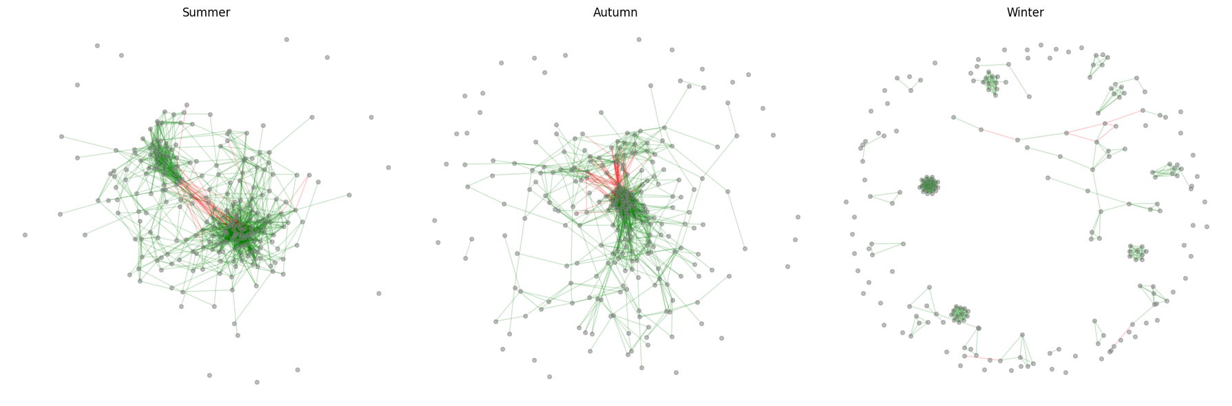
If you do not do the FDR and remove high taxa, the networks will be hard to distinguis visually, mostly because of all the false positive association hits. Quite surprisingly, out of 1000*1000 tables, we get a clear visual separation of the community interaction patterns.
Streamline the whole NB
It is now simple to define high-level method which takes dictionary of all the parametres as input and runs all of the above functions.
def network_analysis(params):
    # prepare metadata
    if params['drop_metadata_duplicates']:
        full_metadata = params['metadata'].drop_duplicates(subset='replicate info', keep='first')
    else:
        full_metadata = params['metadata']

    ssu_filled = fill_taxonomy_placeholders(params["data"], params["taxonomy_cols"])

    print("Original DataFrame shape:", ssu_filled.shape)
    ssu_filled = remove_high_taxa(ssu_filled,
                                  taxonomy_ranks=params["taxonomy_cols"],
                                  tax_level=params["remove_high_taxa_level"])
    print("Filtered DataFrame shape:", ssu_filled.shape)

    ssu_pivot = pivot_taxonomic_data(ssu_filled)

    del ssu_filled
    ssu_filt = prevalence_cutoff(ssu_pivot, percent=params['prevalence_cutoff'], skip_columns=0)
    del ssu_pivot
    ssu_rarefied = rarefy_table(ssu_filt, depth=params['rarefy_depth'], axis=1)
    del ssu_filt

    groups = split_metadata(full_metadata, params['factor'])

    for groups_key in list(groups.keys()):
        print(f"{groups_key}: {len(groups[groups_key])} samples")
        if len(groups[groups_key]) < 3:
            del groups[groups_key]
            print(f"Warning: {groups_key} has less than 3 samples, therefore removed.")

    split_taxonomy = split_taxonomic_data_pivoted(ssu_rarefied, groups)

    spearman_taxa = spearman_from_taxonomy(split_taxonomy)

    for factor, d in spearman_taxa.items():
        pvals_fdr = fdr_pvals(d['p_vals'], pval_cutoff=params['fdr_cutoff'])
        spearman_taxa[factor]['p_vals_fdr'] = pvals_fdr

    plot_fdr(spearman_taxa, params['fdr_cutoff'])
    plot_association_histogram(spearman_taxa)

    network_results = build_interaction_graphs(
        spearman_taxa,
        pos_cutoff=params["network_pos_cutoff"],
        neg_cutoff=params["network_neg_cutoff"],
        p_val_cutoff=params["fdr_cutoff"],
    )

    print('Jaccard Similarity (Positive Edges):')
    display(pairwise_jaccard_lower_triangle(network_results, edge_type='edges_pos'))
    print('Jaccard Similarity (Negative Edges):')
    display(pairwise_jaccard_lower_triangle(network_results, edge_type='edges_neg'))
    print('Jaccard Similarity (All Edges):')
    display(pairwise_jaccard_lower_triangle(network_results, edge_type='all'))

    res_df = network_results_df(network_results, params['factor'])
    display(res_df)

    df_centrality = create_centrality_dataframe(network_results, params['factor'])
    display(df_centrality)

    plot_network(network_results, spearman_taxa)
Define your inputs and run the whole pipeline
params = {
    "data": ssu,
    "metadata": full_metadata,
    "taxonomy_cols": ['superkingdom', 'kingdom', 'phylum', 'class', 'order', 'family', 'genus', 'species'],
    "remove_high_taxa_level": 'phylum',
    'prevalence_cutoff': 10,
    'rarefy_depth': None,
    'drop_metadata_duplicates': True,
    'factor': 'environment (material)',
    'fdr_cutoff': 0.05,
    "network_pos_cutoff": 0.5,
    "network_neg_cutoff": -0.3,
}

# run everything
# network_analysis(params)
Summary
None of this answers any of the possible question you want to ask, but with the growing literature applying complex network methods to metagenomics data in combination of unique unified sampling and sequencing approach by EMO-BON, this dataset is ideal to push the boundaries of monitoring using the above described tool set.
Factors can be any categorical variable from the metadata table. However alternative approach to color and evaluate the associations is to color the graph but some knowledge about the taxa, such r- or K- community species classification etc.