Last update 👈
David Palecek, April 22, 2025
This is far from perfect example, but the point being that that treating the EMO-BON samplings as complex networks, ie. graphs provides advantages on how to compare the results over time and space.
Every sequencing event is represented as a graph. Graphs can be constructed on both taxonomy 1 and functional tables. Depending on the question at hand, different graphs represent the sequencing result rK communities.
Here I create graphs from the secondary analysis (GECCO) runs to identify Biosynthetic Gene Clusters (BGCs).
Note
Pilot demos allow to submit and receive GECCO jobs run on Galaxy. If interested, start here
Setup
I ran GECCO locally on the assembled contigs from the metaGOflow for one single station (Ria Formosa). 16 total sequencing analyses in batch 1 and batch 2 are distributed into replicates, soft sediment and water column samplings and 3 collection dates, which results in overall limited time series of maximum 3 time-points, but sufices for demonstration purposes.
gecco -v run --genome XXX.faGECCO version 0.9.10, default parameters.
Loading data and metadata
import pandas as pd
from momics.loader import bytes_to_df
import matplotlib.pyplot as plt
import networkx as nx

from momics.metadata import get_metadata, enhance_metadata, filter_metadata_table, filter_data

def bgc_tables_dict(tsv_names: list):
    """
    Combine multiple BGC tables into a single DataFrame.

    Args:
        tvs_files (list): List of file paths to the TVS files.

    Returns:
        pd.DataFrame: Combined DataFrame with all BGC data.
    """
    tables_dict = {}
    for name in tsv_names:
        try:
            url = f"https://raw.githubusercontent.com/fair-ease/doc-jupyterbook-mgo/refs/heads/main/book/assets/data/gecco_clusters/{name}_final.contigs.clusters.tsv"
            df = pd.read_csv(url, sep="\t", header=0, index_col=0)
            tables_dict[name] = df
        except Exception as e:
            print(f"Error reading file {name}: {e}")
            continue
    return tables_dict


# TODO: I need to add metadata somehow
## method to merge tracker and shipments data
def merge_tracker_metadata(df_tracker):
    BATCH1_RUN_INFO_PATH = (
        "https://raw.githubusercontent.com/emo-bon/sequencing-data/main/shipment/"
        "batch-001/run-information-batch-001.csv"
    )
    BATCH2_RUN_INFO_PATH = (
        "https://raw.githubusercontent.com/emo-bon/sequencing-data/main/shipment/"
        "batch-002/run-information-batch-002.csv"
    )
    df = pd.read_csv(BATCH1_RUN_INFO_PATH)
    df1 = pd.read_csv(BATCH2_RUN_INFO_PATH)
    df = pd.concat([df, df1])
    print(len(df))

    # select only batch 1 and 2 from tracker data
    df_tracker = df_tracker[df_tracker['batch'].isin(['001', '002'])]

    # merge with tracker data on ref_code
    df = pd.merge(df, df_tracker, on='ref_code', how='inner')

    # split the sequenced tables
    df_discarded = df[df['lib_reads_seqd'].isnull()]
    df1 = df[~df['lib_reads_seqd'].isnull()]

    # deliver only filters and sediment samples, no blanks
    df_to_deliver = df1[df1['sample_type'].isin(['filters', 'sediment'])].reset_index(drop=True)
    #drop columns
    df_to_deliver.drop(columns='reads_name_y', inplace=True)
    df_to_deliver.rename(columns={'reads_name_x': 'reads_name'}, inplace=True)
    return df_to_deliver, df_discarded

def combine_metadata():
    url_metadata = "https://raw.githubusercontent.com/emo-bon/emo-bon-data-validation/refs/heads/main/validated-data/Batch1and2_combined_logsheets_2024-11-12.csv"
    url_tracker = "https://raw.githubusercontent.com/emo-bon/momics-demos/refs/heads/main/wf0_landing_page/emobon_sequencing_master.csv"

    df_metadata = pd.read_csv(url_metadata ,index_col=0)
    df_tracker = pd.read_csv(url_tracker ,index_col=0)
    df_to_deliver, _ = merge_tracker_metadata(df_tracker)
    assert len(df_to_deliver) == 181, "Number of samples in the metadata is not correct"

    mapper = df_to_deliver[['ref_code', 'source_mat_id', 'reads_name']]
    mapper['reads_name_short'] = mapper['reads_name'].str.split('_').str[-1]

    df_full = mapper.merge(df_metadata, on='ref_code', how='inner')
    assert len(df_full) == 181, "Number of samples in the metadata is not correct"
    return df_full

df_metadata = combine_metadata()

## validation DF
url_valid = "https://raw.githubusercontent.com/emo-bon/momics-demos/refs/heads/main/data/shipment_b1b2_181.csv"
df_valid = pd.read_csv(url_valid)

## enhance metadata
df_metadata = enhance_metadata(df_metadata, df_valid)
227
/tmp/ipykernel_2379/2860836144.py:73: SettingWithCopyWarning:
A value is trying to be set on a copy of a slice from a DataFrame.
Try using .loc[row_indexer,col_indexer] = value instead

See the caveats in the documentation: https://pandas.pydata.org/pandas-docs/stable/user_guide/indexing.html#returning-a-view-versus-a-copy
  mapper['reads_name_short'] = mapper['reads_name'].str.split('_').str[-1]
Batch 1+2 contain 181 valid samples, which should be the first value. The second value is number of metadata columns available for each samplling. Note that not all are obligatory, therefore the table contains many missing values.
assert df_metadata.shape[0] == 181

print(df_metadata.shape)
(181, 122)
Here I hardcode list of names for which GECCO was run, plus a color hash for the BGC coloring. Note that BGCs are colored, domains will be in grey, which are inherently different nodes. Each cluster is composed from 1 to many nodes, which can be shared between the BGCs and therefore I use them as nodes to connect the BGCs with edges.
data_list = [
    "HCFCYDSX5.UDI129",
    "HVWGWDSX5.UDI102",
    "HCFCYDSX5.UDI130",
    "HVWGWDSX5.UDI103",
    "HCFCYDSX5.UDI131",
    "HVWGWDSX5.UDI115",
    "HCFCYDSX5.UDI132",
    "HVWGWDSX5.UDI127",
    "HMNJKDSX3.UDI234",
    "HVWGWDSX5.UDI150",
    "HMNJKDSX3.UDI236",
    "HVWGWDSX5.UDI162",
    "HMNJKDSX3.UDI246",
    "HVWGWDSX5.UDI174",
    "HMNJKDSX3.UDI250",
    "HVWGWDSX5.UDI186",
]

color_hash = {
    'NRP': 'red',
    'PKS': 'blue',
    'RiPPs': 'darkgreen',
    'Terpene': 'brown',
    'Unknown': 'black',
    'Polyketide': 'purple',
    'NRP;Polyketide': 'orange',
    'RiPP': 'darkblue',
    'Saccharide': 'darkred',
    'domain': 'lightgrey',
}

tables = bgc_tables_dict(data_list)
Graph methods
Below are methods I use to construct the network using networkx package. They include adding two types of nodes, color BGCs and grey domain nodes, create the graph edges (edges). generate_graph() puts all this into a single graph which has its own identifier constructed from replicate, observation ID, collection date, environmental material and filter used.
Then we have functions to plot the graph (plot_graph()) and domain count histogram (plot_domain_edges_counts()), respectively.
def graph_nodes_edges(df, color_hash):
    nodes = []
    for i, row in df.iterrows():
        nodes.append(
            (
                row['cluster_id'],
                {'type': row['type'],
                'color': color_hash[row['type']],
                }
            ),
        )
    print(f"Number of BGC nodes: {len(nodes)}")

    nodes_domains = []
    already_seen = set()
    for i, row in df.iterrows():
        domains = row['domains'].strip().split(';')
        for domain in domains:
            if domain not in already_seen:
                already_seen.add(domain)
                nodes_domains.append(
                    (
                        domain,
                        {'type': "domain_node",
                        'color': "grey",
                        }
                    ),
                )
            else:
                pass

    assert len(nodes_domains) == len(already_seen), f"Number of nodes is not correct, {len(nodes_domains)} != {len(already_seen)}"
    print(f"Number of nodes from domains: {len(nodes_domains)}")

    edges = []

    for i, row in df.iterrows():
        lst_domains = list(set(row['domains'].strip().split(';')))
        assert len(lst_domains) == len(set(lst_domains)), f"Number of domains is not correct, {len(lst_domains)} != {len(set(lst_domains))}"
        for j in range(len(lst_domains)):
            # connect cluster ids to domains
            edges.append((row['cluster_id'], lst_domains[j]))

    print(f"Number of edges: {len(edges)}")
    return nodes, nodes_domains, edges

def generate_graph(nodes, nodes_domains, edges, collection_date):
    import networkx as nx
    G = nx.Graph(
        date = collection_date,
    )

    G.add_nodes_from(nodes)
    G.add_nodes_from(nodes_domains)
    G.add_edges_from(edges)
    return G


def plot_graph(G, color_hash):
    colors = [k[1]['color'] for k in G.nodes(data=True)]

    # drawing nodes and edges separately so we can capture collection for colobar
    pos = nx.spring_layout(G, k=0.2)
    # pos = nx.kamada_kawai_layout(G)
    # pos = nx.spiral_layout(G)
    ec = nx.draw_networkx_edges(G, pos, alpha=0.2)
    nc = nx.draw_networkx_nodes(G, pos, nodelist=G.nodes, node_color=colors,
                                node_size=15,
                                alpha=0.5,
                                # cmap=plt.cm.jet,
                                )
    plt.axis('off')
    plt.legend(
        handles=[plt.Line2D([0], [0], marker='o', color='w', label=k, markerfacecolor=v)
                for k, v in color_hash.items()],
        loc='upper left',
        bbox_to_anchor=(1, 1),
        title="BGC type",
    )
    plt.title(f"Sample info: {G.graph['date']}")

from collections import Counter
def count_multiple_edges(edges):
    """
    Count appearances of the second position in the edge tuple and filter those with more than one occurrence.

    Args:
        edges (list): List of edge tuples.

    Returns:
        tuple: A tuple containing:
            - cnt_full (Counter): Full count of appearances.
            - cnt_multiple (dict): Filtered counts with more than one occurrence.
    """
    edge_counter = [e[1] for e in edges]
    cnt_full = Counter(edge_counter)

    # Filter those which have more than 1
    cnt_multiple = {k: v for k, v in cnt_full.items() if v > 1}
    cnt_multiple = dict(sorted(cnt_multiple.items(), key=lambda item: item[1], reverse=True))

    return cnt_full, cnt_multiple


def plot_domain_edges_counts(counts, title: str = "Domain counts"):
    # barplot
    plt.bar(counts.keys(), counts.values())
    plt.xticks(rotation=90)
    plt.xlabel('Domain')
    plt.ylabel('Count')
    plt.title('Domain Counts')
    plt.tight_layout()
    plt.title(title, )


def create_graph_id(df_metadata: pd.DataFrame, name: str):
    graph_id = df_metadata[df_metadata['reads_name_short'] == name]['replicate_info'].values.tolist()[0]
    return graph_id
Example BGC graph
Example of a resulting graph can look like this one
# over all
name = data_list[0]

df = tables[name]
nodes, nodes_domains, edges = graph_nodes_edges(df, color_hash)

# contitutes date nad replicate number to make it unique
graph_id = create_graph_id(df_metadata, name)
G = generate_graph(nodes, nodes_domains, edges, graph_id)
plot_graph(G, color_hash)
Number of BGC nodes: 65
Number of nodes from domains: 137
Number of edges: 481
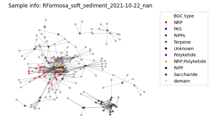
Of course one cannot see anything useful, the same way as looking at the .csv tables underlaying this graph. However many descriptor metrics exist for such graphs, which describe connectivite, relatedness etc.
Graph analysis
Domain counter
Not related yet to the graph, we can plot the distribution of domains identified over all the BGCs
# count domain appearence
cnt_full, cnt_multiple = count_multiple_edges(edges)

# plot the histogram
plot_domain_edges_counts(cnt_multiple, f"Sample info: {G.graph['date']}")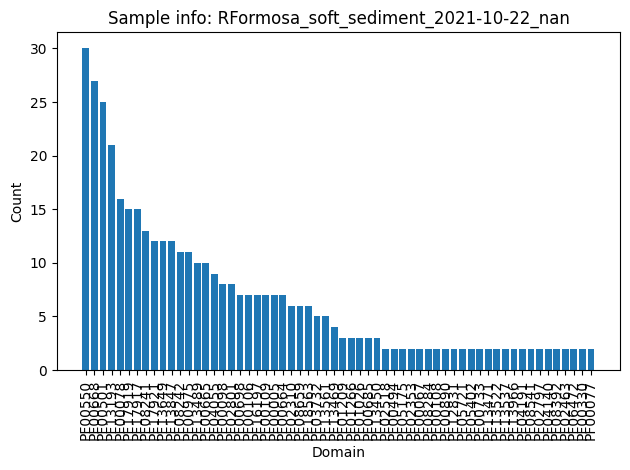
Graph metrics
Check out exhaustive list of networkx algorithms in the docs. Few random examples here
percentage of nodes which are bridges A bridge in a graph is an edge whose removal causes the number of connected components of the graph to increase. Equivalently, a bridge is an edge that does not belong to any cycle. Bridges are also known as cut-edges, isthmuses, or cut arcs.
print(f"{round(len(list(nx.bridges(G, root=None)))/G.number_of_nodes() * 100, 2)} %")40.1 %
Maximum independent set An independent set is a set of vertices in a graph where no two vertices in the set are adjacent. The maximum independent set is the independent set of largest possible size for a given graph.
from networkx.algorithms.approximation import maximum_independent_set

ind_set = maximum_independent_set(G)
print(f"Size of Maximum independent set: {len(ind_set)}")
Size of Maximum independent set: 96
Average degree connectivity The average degree connectivity is the average nearest neighbor degree of nodes with degree k.
nx.average_degree_connectivity(G){5: 10.854545454545455,
3: 10.80952380952381,
21: 7.571428571428571,
6: 12.983333333333333,
11: 12.763636363636364,
7: 10.648351648351648,
16: 6.21875,
9: 11.177777777777777,
2: 9.637931034482758,
4: 18.416666666666668,
18: 11.777777777777779,
12: 8.116666666666667,
8: 11.075,
10: 12.85,
13: 11.948717948717949,
14: 13.285714285714286,
15: 8.222222222222221,
23: 9.91304347826087,
1: 9.779220779220779,
30: 9.466666666666667,
27: 8.555555555555555,
25: 10.52}Average node connectivity The average connectivity bar{kappa} of a graph G is the average of local node connectivity over all pairs of nodes of G.
nx.average_node_connectivity(G)1.1365942564405693Time evolution
The above metrics are related to individual sequencing results, therefore they can be compared based on metadata (in the permanova style) or simple plotted over time or any other conditions.
Let’s try to display nx.average_node_connectivity(G) over time for our series of samples
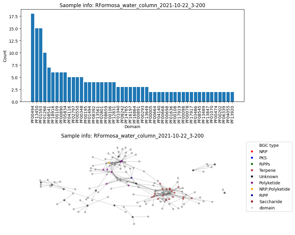
First, construct all the graphs, plot graph and the histogram, calculte the connectivity and add those values to the DF (out of laziness).
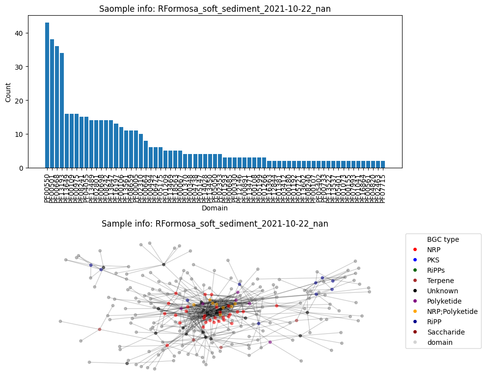
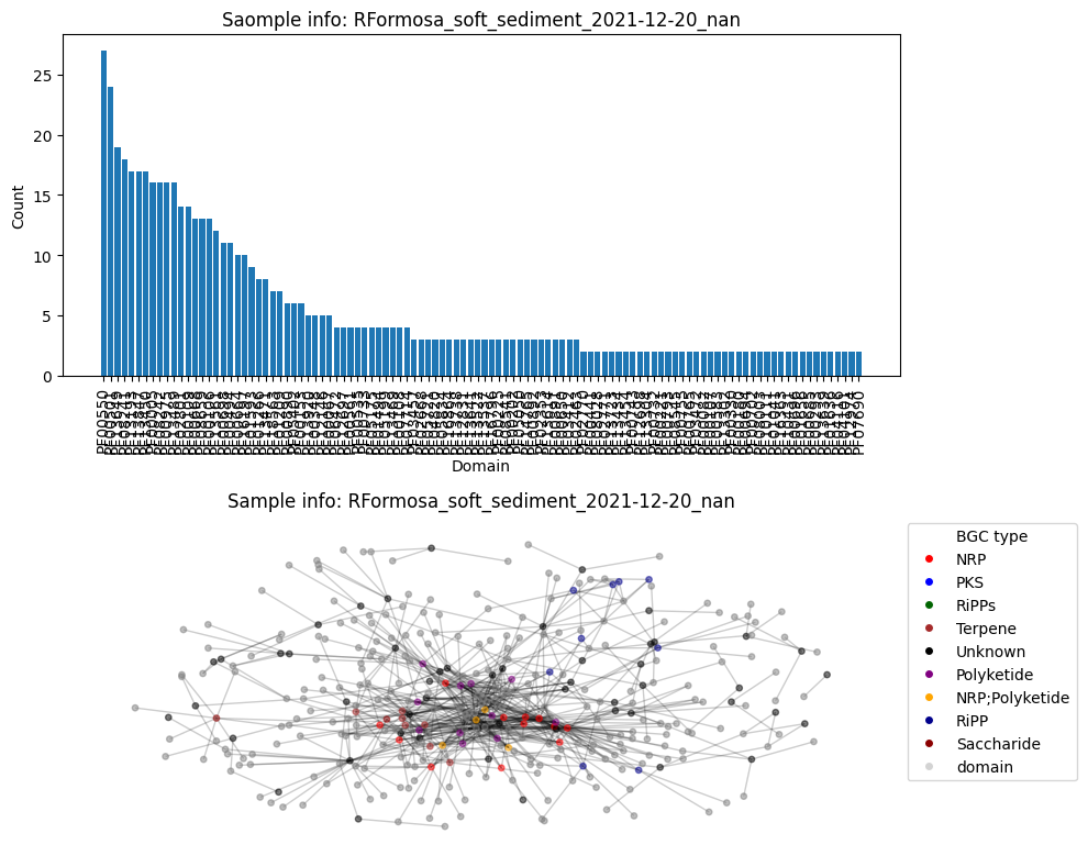
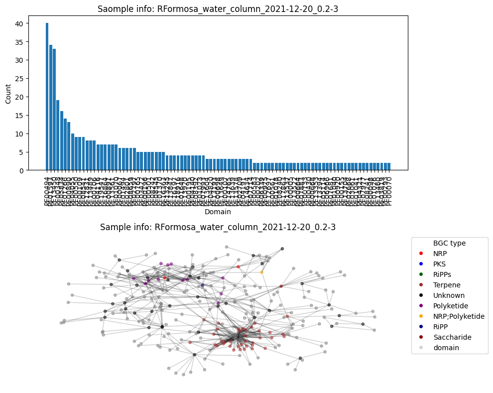
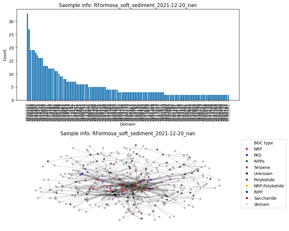
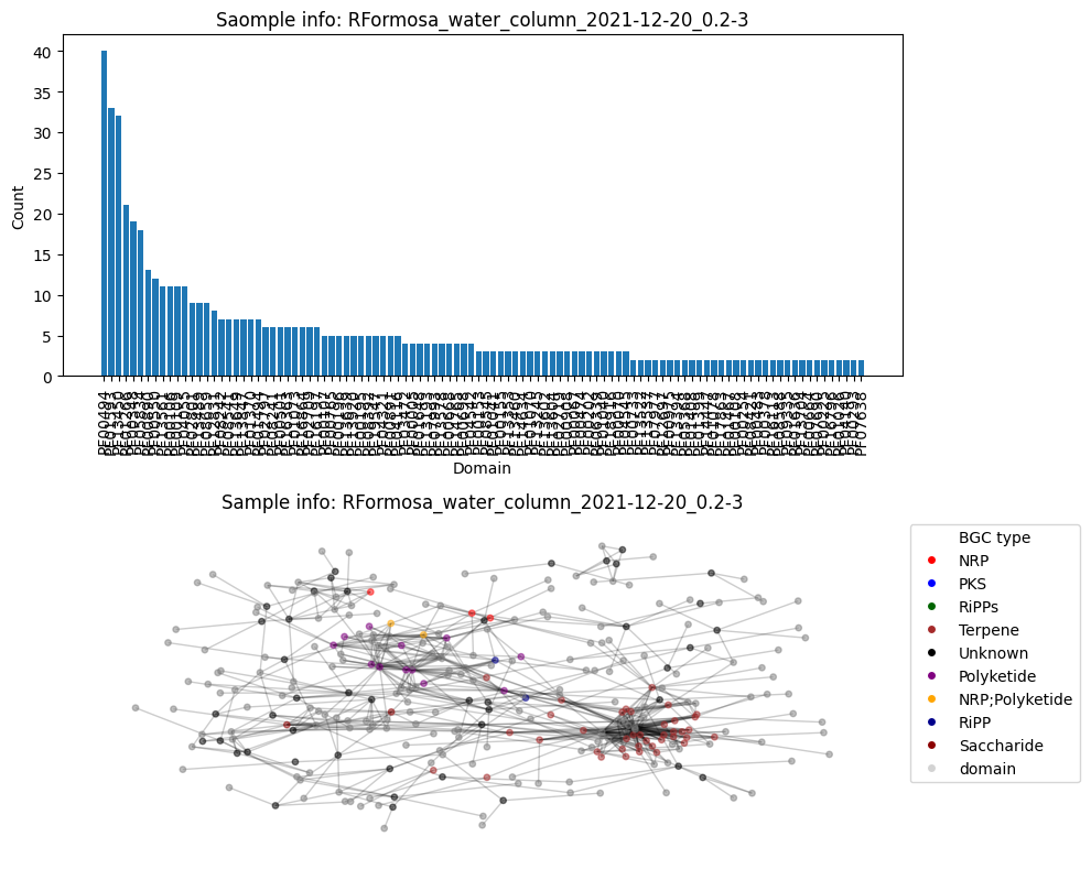
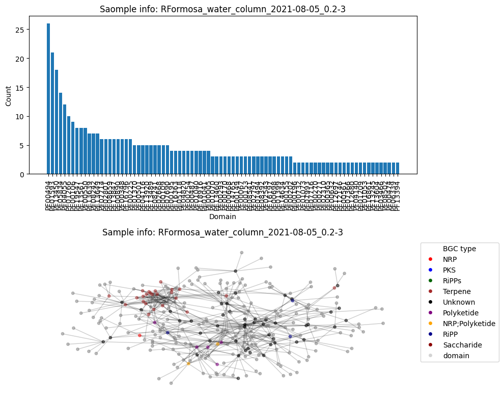
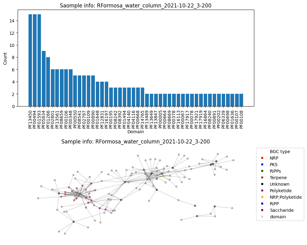
## all graphs
df_metadata['connectivity'] = 0.0
df_metadata['bgc_nodes'] = 0
df_metadata['total_edges'] = 0
df_metadata['domain_nodes'] = 0
for name in data_list:
    df = tables[name]
    collection_date = create_graph_id(df_metadata, name)

    nodes, nodes_domains, edges = graph_nodes_edges(tables[name], color_hash)
    G = generate_graph(nodes, nodes_domains, edges, collection_date)
    cnt_full, cnt_multiple = count_multiple_edges(edges)

    plt.subplots(2, 1, figsize=(10, 8))
    plt.subplot(2, 1, 1)
    plot_domain_edges_counts(cnt_multiple, f"Saomple info: {G.graph['date']}")
    plt.subplot(2, 1, 2)
    plot_graph(G, color_hash)
    plt.tight_layout()
    plt.show()

    # calculate the average degree connectivity of graph.
    avg_conn = nx.average_node_connectivity(G)
    print(f"Average node connectivity for {name}: {avg_conn}")
    df_metadata.loc[df_metadata['reads_name_short'] == name, 'connectivity'] = avg_conn
    df_metadata.loc[df_metadata['reads_name_short'] == name, 'bgc_nodes'] = len(nodes)
    df_metadata.loc[df_metadata['reads_name_short'] == name, 'total_edges'] = len(edges)
    df_metadata.loc[df_metadata['reads_name_short'] == name, 'domain_nodes'] = len(nodes_domains)
Number of BGC nodes: 65
Number of nodes from domains: 137
Number of edges: 481
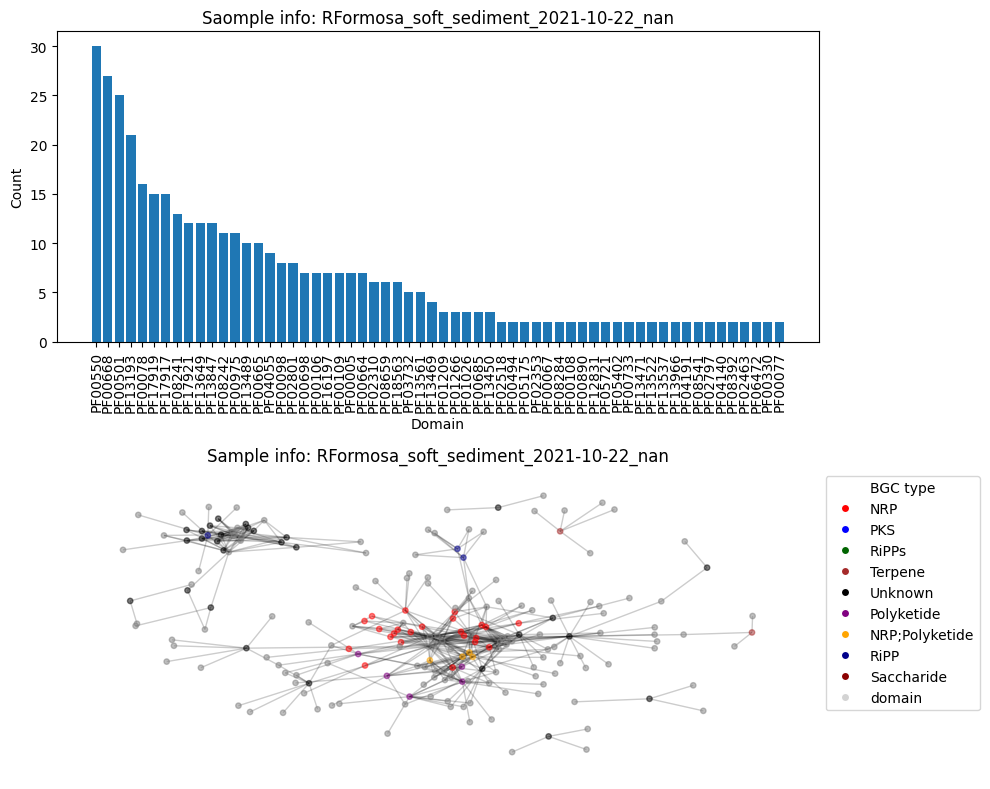
Average node connectivity for HCFCYDSX5.UDI129: 1.1365942564405693
Number of BGC nodes: 41
Number of nodes from domains: 110
Number of edges: 267
Average node connectivity for HVWGWDSX5.UDI102: 0.9924944812362031
Number of BGC nodes: 72
Number of nodes from domains: 183
Number of edges: 634
Average node connectivity for HCFCYDSX5.UDI130: 1.756739231125521
Number of BGC nodes: 58
Number of nodes from domains: 142
Number of edges: 355
Average node connectivity for HVWGWDSX5.UDI103: 1.2028643216080401
Number of BGC nodes: 96
Number of nodes from domains: 264
Number of edges: 753
Average node connectivity for HCFCYDSX5.UDI131: 1.392200557103064
Number of BGC nodes: 90
Number of nodes from domains: 186
Number of edges: 592
Average node connectivity for HVWGWDSX5.UDI115: 1.785612648221344
Number of BGC nodes: 116
Number of nodes from domains: 275
Number of edges: 835
Average node connectivity for HCFCYDSX5.UDI132: 1.5790019017640502
Number of BGC nodes: 103
Number of nodes from domains: 200
Number of edges: 675
Average node connectivity for HVWGWDSX5.UDI127: 1.7417874237754902
Number of BGC nodes: 83
Number of nodes from domains: 206
Number of edges: 520
Average node connectivity for HMNJKDSX3.UDI234: 1.6891820453671664
Number of BGC nodes: 35
Number of nodes from domains: 91
Number of edges: 240
Average node connectivity for HVWGWDSX5.UDI150: 1.391873015873016
Number of BGC nodes: 8
Number of nodes from domains: 44
Number of edges: 52
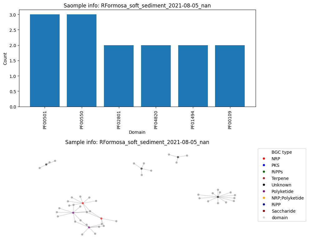
Average node connectivity for HMNJKDSX3.UDI236: 0.36048265460030166
Number of BGC nodes: 92
Number of nodes from domains: 222
Number of edges: 626
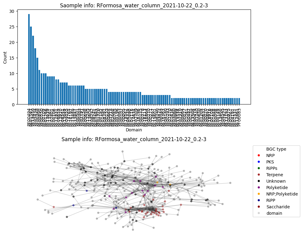
Average node connectivity for HVWGWDSX5.UDI162: 1.7973179218982114
Number of BGC nodes: 75
Number of nodes from domains: 194
Number of edges: 411
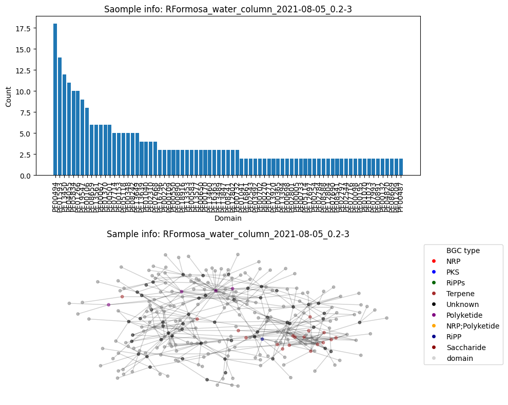
Average node connectivity for HMNJKDSX3.UDI246: 1.4036786328580149
Number of BGC nodes: 74
Number of nodes from domains: 189
Number of edges: 438

Average node connectivity for HVWGWDSX5.UDI174: 1.195251502046266
Number of BGC nodes: 38
Number of nodes from domains: 139
Number of edges: 339

Average node connectivity for HMNJKDSX3.UDI250: 1.2358757062146892
Number of BGC nodes: 37
Number of nodes from domains: 107
Number of edges: 248
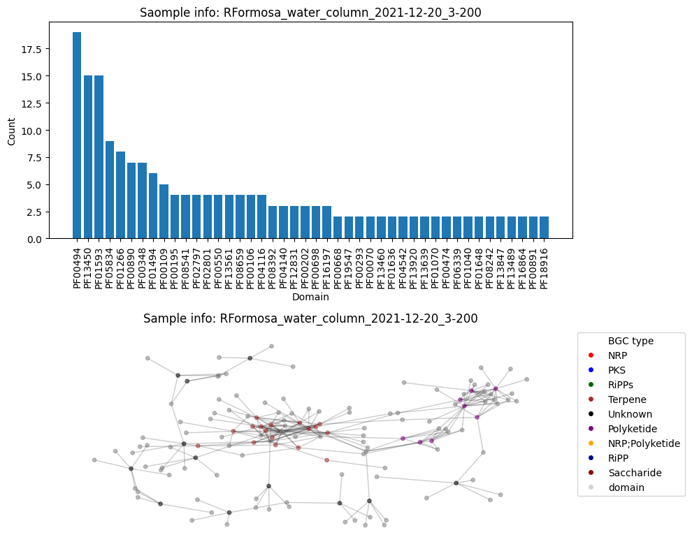
Average node connectivity for HVWGWDSX5.UDI186: 1.0968337218337219
Now take different subsets of the 16 Ria Formosa samples and plot the evolution of the connectivity over 3 sampling dates
df_to_plot = df_metadata[df_metadata['connectivity'] > 0.0]

# filter tables
water = df_to_plot[df_to_plot['env_package'] == 'water_column']
sediment = df_to_plot[df_to_plot['env_package'] == 'soft_sediment']

water_eukaryotes = water[water['size_frac'] == '3-200']
water_prokaryotes = water[water['size_frac'] == '0.2-3']
water_nan = water[water['size_frac'].isnull()]

sediment_eukaryotes = sediment[sediment['size_frac'] == '3-200']
sediment_prokaryotes = sediment[sediment['size_frac'] == '0.2-3']
sediment_nan = sediment[sediment['size_frac'].isnull()]

plt.figure(figsize=(10, 5))
plt.plot(water_eukaryotes['collection_date'], water_eukaryotes['connectivity'], 'o', ms=8, linewidth=0.3, label='water Eukaryotes')
plt.plot(water_prokaryotes['collection_date'], water_prokaryotes['connectivity'], 'o', ms=8,linewidth=0.3, label='water Prokaryotes')
plt.plot(sediment_eukaryotes['collection_date'], sediment_eukaryotes['connectivity'], 'o', ms=8,linewidth=0.3, label='sediment Eukaryotes')
plt.plot(sediment_prokaryotes['collection_date'], sediment_prokaryotes['connectivity'], 'o', ms=8,linewidth=0.3, label='sediment Prokaryotes')
plt.plot(sediment_nan['collection_date'], sediment_nan['connectivity'], 'o', ms=8,linewidth=0.3, label='sediment Nan filter')
plt.xlabel('Collection date')
plt.ylabel('Average node connectivity')
plt.title('Average node connectivity over time')
plt.xticks(rotation=30)
plt.show()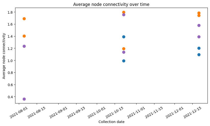
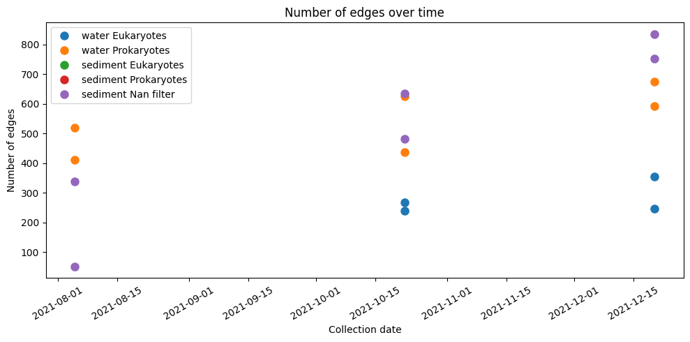
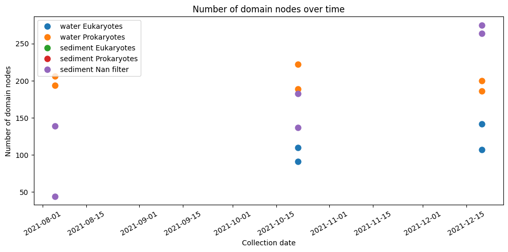
Additionally, we plot total amount of BGCs, domains and edges for each type of sample over time.
plt.figure(figsize=(10, 5))
plt.plot(water_eukaryotes['collection_date'], water_eukaryotes['bgc_nodes'], 'o', ms=8, label='water Eukaryotes')
plt.plot(water_prokaryotes['collection_date'], water_prokaryotes['bgc_nodes'], 'o', ms=8, label='water Prokaryotes')
plt.plot(sediment_eukaryotes['collection_date'], sediment_eukaryotes['bgc_nodes'], 'o', ms=8, label='sediment Eukaryotes')
plt.plot(sediment_prokaryotes['collection_date'], sediment_prokaryotes['bgc_nodes'], 'o', ms=8, label='sediment Prokaryotes')
plt.plot(sediment_nan['collection_date'], sediment_nan['bgc_nodes'], 'o', ms=8, label='sediment Nan filter')
plt.xlabel('Collection date')
plt.ylabel('Number of BGCs')
plt.title('Number of BGCs over time')
plt.xticks(rotation=30)
plt.tight_layout()
plt.legend()
plt.show()

plt.figure(figsize=(10, 5))
plt.plot(water_eukaryotes['collection_date'], water_eukaryotes['total_edges'], 'o', ms=8, label='water Eukaryotes')
plt.plot(water_prokaryotes['collection_date'], water_prokaryotes['total_edges'], 'o', ms=8, label='water Prokaryotes')
plt.plot(sediment_eukaryotes['collection_date'], sediment_eukaryotes['total_edges'], 'o', ms=8, label='sediment Eukaryotes')
plt.plot(sediment_prokaryotes['collection_date'], sediment_prokaryotes['total_edges'], 'o', ms=8, label='sediment Prokaryotes')
plt.plot(sediment_nan['collection_date'], sediment_nan['total_edges'], 'o', ms=8, label='sediment Nan filter')
plt.xlabel('Collection date')
plt.ylabel('Number of edges')
plt.title('Number of edges over time')
plt.xticks(rotation=30)
plt.tight_layout()
plt.legend()
plt.show()

plt.figure(figsize=(10, 5))
plt.plot(water_eukaryotes['collection_date'], water_eukaryotes['domain_nodes'], 'o', ms=8, label='water Eukaryotes')
plt.plot(water_prokaryotes['collection_date'], water_prokaryotes['domain_nodes'], 'o', ms=8, label='water Prokaryotes')
plt.plot(sediment_eukaryotes['collection_date'], sediment_eukaryotes['domain_nodes'], 'o', ms=8, label='sediment Eukaryotes')
plt.plot(sediment_prokaryotes['collection_date'], sediment_prokaryotes['domain_nodes'], 'o', ms=8, label='sediment Prokaryotes')
plt.plot(sediment_nan['collection_date'], sediment_nan['domain_nodes'], 'o', ms=8, label='sediment Nan filter')
plt.xlabel('Collection date')
plt.ylabel('Number of domain nodes')
plt.title('Number of domain nodes over time')
plt.xticks(rotation=30)
plt.tight_layout()
plt.legend()
plt.show()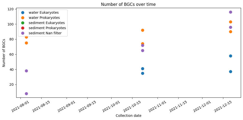
Summary
None of this answers any of the possible question you want to ask, but with the growing literature applying complex network methods to metagenomics data in combination of unique unified sampling and sequencing approach by EMO_BON, this dataset is ideal to push the boundaries of monitoring using such tool set.
- Liu, Z., Ma, A., Mathé, E., Merling, M., Ma, Q., & Liu, B. (2020). Network analyses in microbiome based on high-throughput multi-omics data. Briefings in Bioinformatics, 22(2), 1639–1655. 10.1093/bib/bbaa005